Visualization of recurrent event data with reReg
Sy Han (Steven) Chiou
2024-05-20
Source:vignettes/reReg-plot.Rmd
reReg-plot.RmdIn this vignette, we demonstrate how to create event plots and mean cumulative function in reReg package. We will illustrate the usage of our functions with the readmission data from the frailtypack package (Rondeau, Mazroui, and González 2012), (González et al. 2005). The data contains re-hospitalization times after surgery in patients diagnosed with colorectal cancer. In this data set, the recurrent event is the readmission and the terminal event is either death or end of study. See ?readmission for data details.
> library(reReg)
> packageVersion("reReg")
[1] '1.4.6'> data(readmission, package = "frailtypack")
> head(readmission) id enum t.start t.stop time event chemo sex dukes charlson death
1 1 1 0 24 24 1 Treated Female D 3 0
2 1 2 24 457 433 1 Treated Female D 0 0
3 1 3 457 1037 580 0 Treated Female D 0 0
4 2 1 0 489 489 1 NonTreated Male C 0 0
5 2 2 489 1182 693 0 NonTreated Male C 0 0
6 3 1 0 15 15 1 NonTreated Male C 3 0For illustration, we first remove subjects who has more than one terminal events.
> readmission <- subset(readmission, !(id %in% c(60, 109, 280)))Event plots
An easy way to glance at recurrent event data is by plotting the event plots. Event plots can be created by applying the generic function plot() to Recur objects directly, as shown in Figure 1.
> reObj <- with(readmission, Recur(t.stop, id, event, death))
> plot(reObj)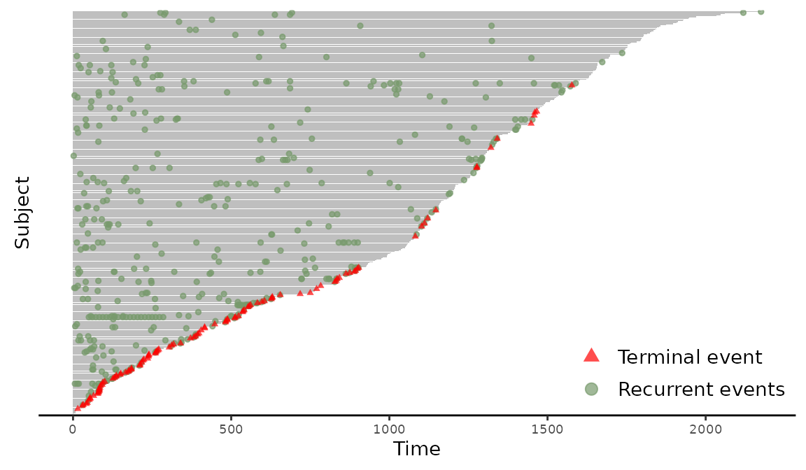
Figure 1: Creating an event plot from a Recur object.
The gray horizontal lines represent each subjects’ follow-up times, the green dots marks the recurrent events, and the red triangles marks terminal events. With the default setting, the event plot is arranged so that subjects with longer follow-up times are presented on the top. The plot() method returns a ggplot2 object (Wickham 2009) to allow extensive flexibility and customization. Common graphical options like xlab, ylab, main, and more can be directly passed down to plot().
> plot(reObj, cex = 1.5, xlab = "Time in days", ylab = "Patients",
+      main = "Event plot for readmission data",
+      terminal.name = "Death",
+      recurrent.name = "Hospital readmission")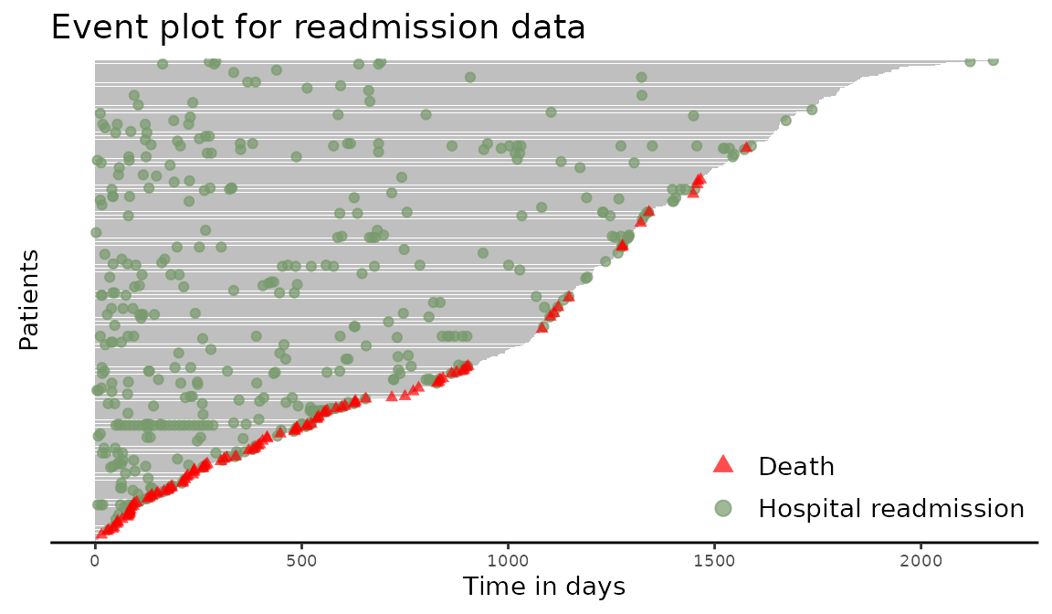
Figure 2: Creating an event plot from a Recur object with custom labels.
Applying the plot() function to Recur objects internally calls the plotEvent() function, which allows users to configure event plots in a model formula. The synopsis of plotEvents() is:
> args(plotEvents)function (formula, data, result = c("increasing", "decreasing",
"asis"), calendarTime = FALSE, control = list(), ...)
NULLThe arguments are as follows
-
formulais a formula object, which contains anRecurobject and categorical covariates separated by~, where the categorical covariates are used to stratify the event plot. -
datais an optional data frame in which to interpret the variables occurring in theformula. -
resultis an optional character string specifying whether the event plot is sorted by the subjects’ terminal time. The available options are-
increasingsort the terminal time from in ascending order (default). This places longer terminal times on top. -
decreasingsort the terminal time from in descending order. This places shorter terminal times on top. -
nonepresent the event plots as is, without sorting by the terminal times.
-
-
calendarTimeis an optional logical value indicating whether to plot in calendar time. WhencalendarTime = FALSE(default), the event plot will have patient time on the x-axis. -
controlis a list of control parameters. -
...are graphical parameters to be passed to theplotEvents()function.
The required argument for plotEvent() is formula. The full list of these parameters with their default values are displayed below.
> args(reReg:::plotEvents.control)function (xlab = NULL, ylab = NULL, main = NULL, terminal.name = NULL,
recurrent.name = NULL, recurrent.type = NULL, legend.position = NULL,
base_size = 12, cex = NULL, alpha = 0.7, width = NULL, bar.color = NULL,
recurrent.color = NULL, recurrent.shape = NULL, recurrent.stroke = NULL,
terminal.color = NULL, terminal.shape = NULL, terminal.stroke = NULL,
not.terminal.color = NULL, not.terminal.shape = NULL)
NULLThe parameters xlab, ylab, and main are adopted from the base R graphics package for modifying labels to the x-axis, the y-axis, and the main title, respectively. The parameters terminal.name and recurrent.name are character labels displayed in the legend. The parameter recurrent.type specifies the recurrent event types to be displayed in the legend when more than one recurrent event types is specified in the Recur object. The parameter legend.position is adopted from the % the legend.position components of the ggplot2 theme to control the location of the legend box. The parameters cex and alpha control the size and the transparency of the symbols on the event plots, respectively. The base_size parameter controls the base font size in pts.
Stratifying the event plot could provide new insights into the different covariate effects. For example, an event plot stratified by the binary variable sex can be produced with the following code.
> plotEvents(Recur(t.stop, id, event, death) ~ sex, data = readmission)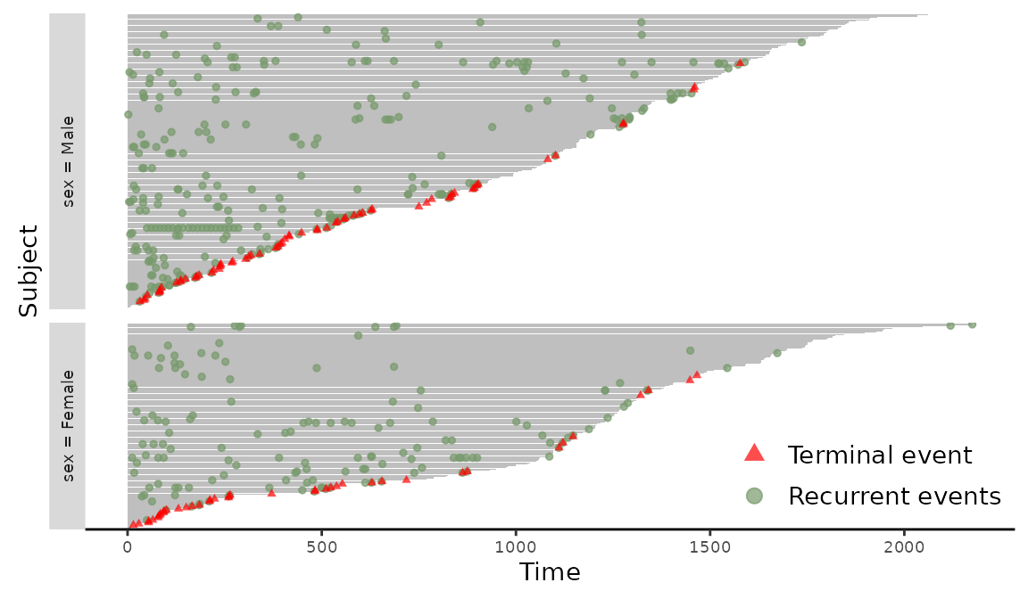
Figure 3: Event plot grouped by sex
Similarly, event plot stratified by sex and chemo can be produced with the following code. The additional argument base_size = 5 is included to display the full legend labels.
> plotEvents(Recur(t.stop, id, event, death) ~ sex + chemo, data = readmission, base_size = 5)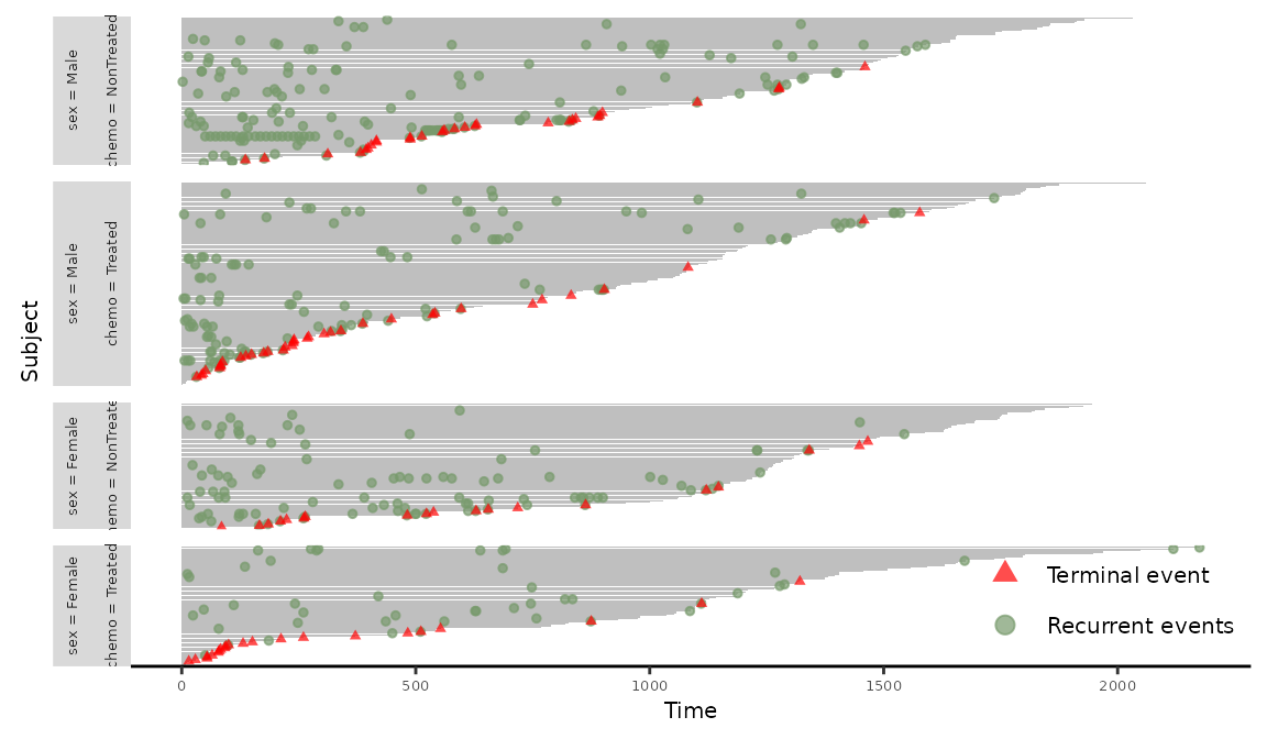
Figure 4: Event plot grouped by sex and chemo.
The plotEvents() can accommodate multiple recurrent types specified via the event argument in the Recur object. To illustrate this feature, we perturb the event indicator so that the value of event indicates the index of the different recurrent event. The following command is used to create the stratified event plot with different recurrent event.
> readmission$event2 <- with(readmission, ifelse(t.stop > 500 & event > 0, 2, event))
> plotEvents(Recur(t.stop, id, event2, death) ~ sex, data = readmission)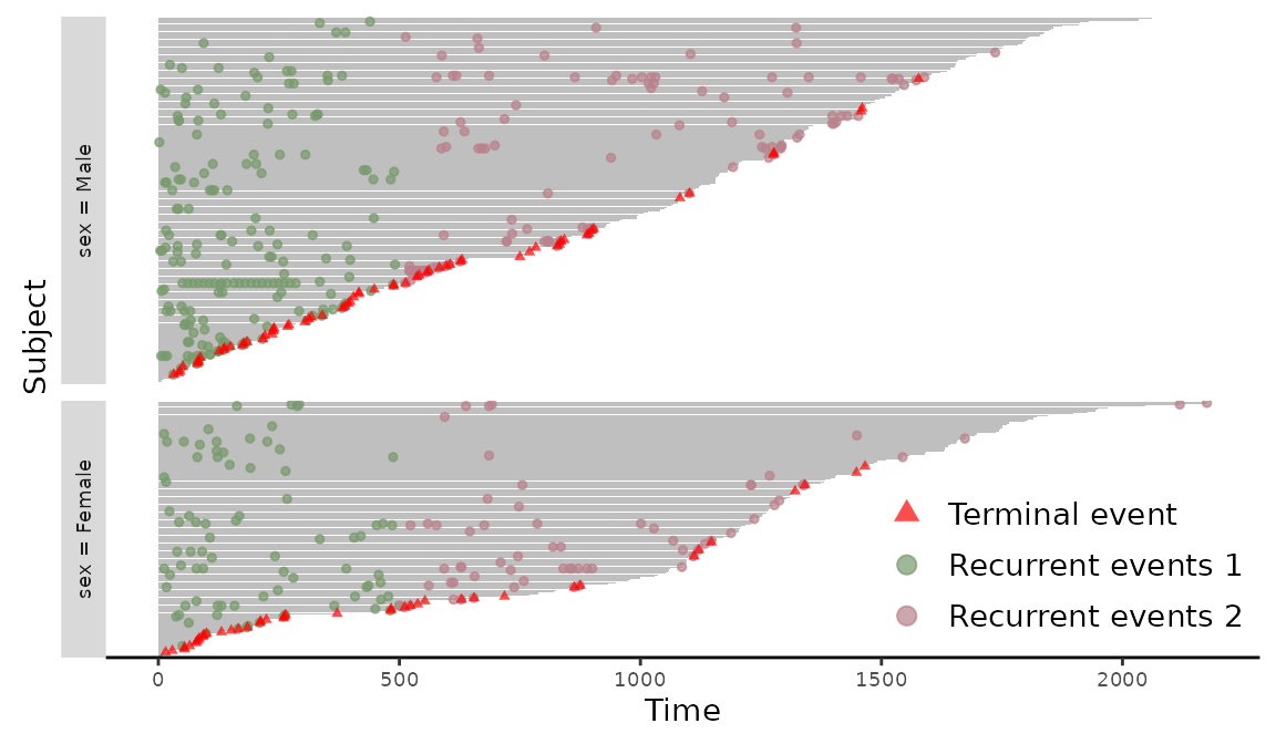
Figure 5: Event plot with multiple events grouped by sex.
The different types of recurrent events are marked in different colors in Figure 5. The plotEvents() function can also create event plots in calendar time by setting calendarTime = TRUE. For illustration, we create a new simulated data based on readmission with time intervals shift proportionally by chemo. We further convert the time intervals to a Date class. The construction of the new data and the stratified event plot in Figure 6 is included in the following
> readmission2 <- readmission
> readmission2$t.start <- as.Date(readmission2$t.start + as.numeric(readmission2$chemo) * 5,
+   origin = "20-01-01")
> readmission2$t.stop <- as.Date(readmission2$t.stop + as.numeric(readmission2$chemo) * 5,
+   origin = "20-01-01")
> plotEvents(Recur(t.start %2% t.stop, id, event2, death) ~ sex, data = readmission2,
+            calendarTime = TRUE)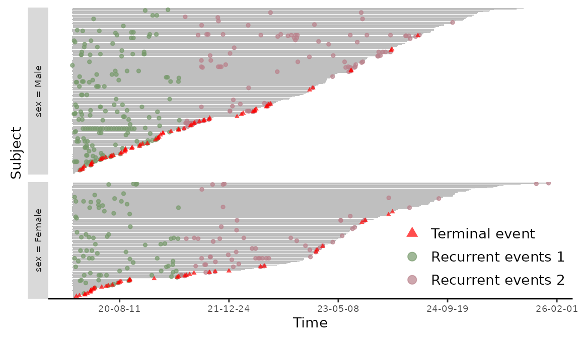
Figure 6: Event plot on calendar time.
In this case, subjects with later censoring times are presented on the top and the date string are printed on the axis label of the event plot.
Mean cumulative function plots
Let \(N(t)\) be the number of recurrent events occurring over the interval \([0, t]\) and \(D\) be the failure time of interest subjects to right censoring by \(C\). Define the composite censoring time \(Y = \min(D, C, \tau)\) and the failure event indicator \(\Delta = I\{D\le \min(C, \tau)\}\), where \(\tau\) is the maximum follow-up time. We assume the recurrent event process \(N(\cdot)\) is observed up to \(Y\). Let \(X\) be a \(p\)-dimensional covariate vector. Consider a random sample of \(n\) subjects, the observed data are independent and identically distributed (iid) copies of \(\{Y_i, \Delta_i, X_i, N_i(t), 0\le t\le Y_i\}\), where the subscript \(i\) denotes the index of a subject for \(i= 1, \ldots, n\). Let \(m_i = N_i(Y_i)\) be the number of recurrent events the \(i\)th subject experienced before time \(Y_i\), then the jump times of \(N_i(t)\) give the observed recurrent event times \(t_{i1}, \ldots, t_{im_i}\) when \(m_i > 0\). Thus, the observed data can also be expressed as iid copies of \(\{Y_i, \Delta_i, X_i, m_i, (t_{i1}, \ldots, t_{m_i})\}\).
Under independence censoring, a nonparametric estimate of \(\Lambda(t)\) known as the Nelson-Aalen estimator is \[\widehat\Lambda(t) = \sum_{i = 1}^n\int_0^t\frac{d N_i(u)}{\sum_{j = 1}^nI(Y_i \ge u)},\] which is also known as the mean cumulative function (MCF). The MCF presents the average number of recurrent events per subject observed by time~\(t\) while adjusting for the risk set. In the case when all subjects remain at risk of recurrent events throughout the study, i.e., \(n = \sum_{j = 1}^nI(Y_i \ge t)\), the Nelson-Aalen estimator reduces to the cumulative sample mean function introduced in Chapter 1 of Cook and Lawless (2007).
The MCF is useful in describing and comparing the average number of events of an individual and between groups. Thus, it provides additional insights into the longitudinal patterns of the recurrent process. Under the independent censoring assumption, the Nelson-Aalen estimate can be created by applying the generic function plot() to the Recur object with an additional argument mcf = TRUE. The following command plots the Nelson-Aalen estimate in Figure 7. The 95% confidence interval is enabled by additionally setting mcf.conf.int = TRUE.
> plot(reObj, mcf = TRUE, mcf.conf.int = TRUE)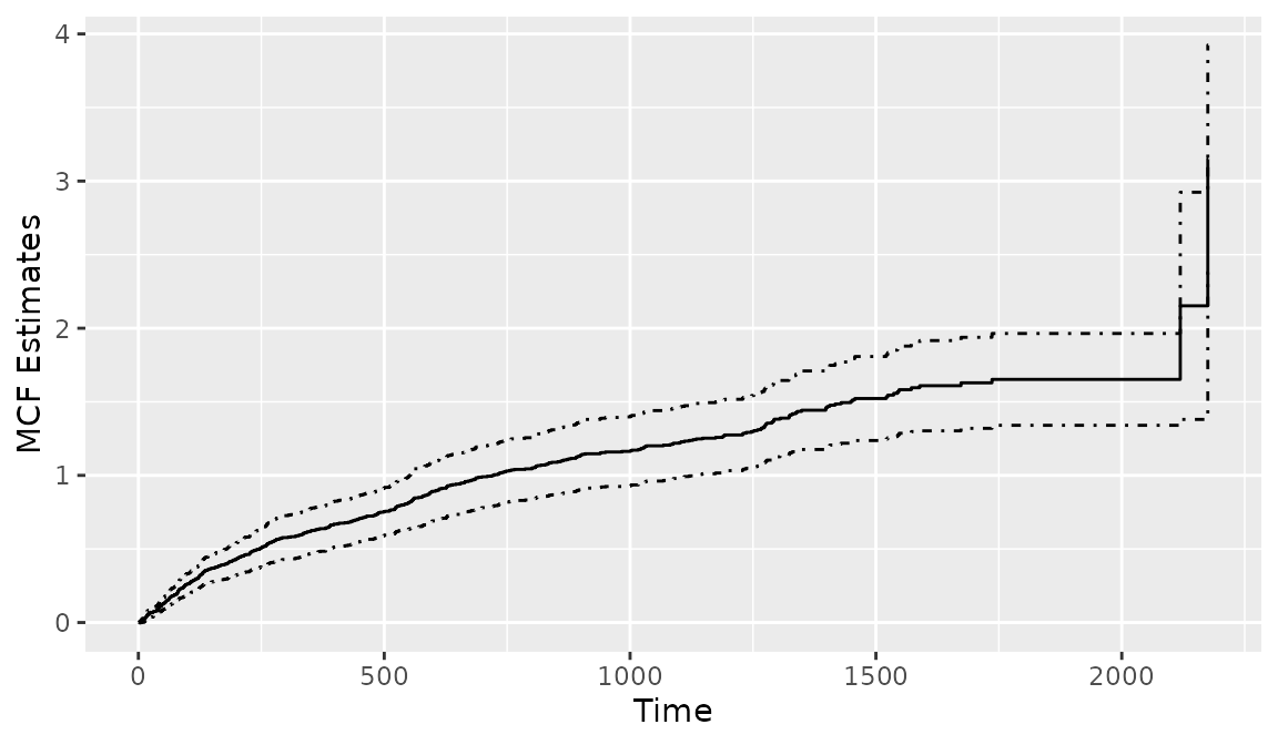
Figure 7: Creating a MCF plot from a Recur object.
To create the cumulative sample mean function, one needs to additionally specify the argument mcf.adjustRiskset = FALSE. Plotting the Recur object with the argument mcf = TRUE internally calls the mcf() function from the reda package (Wang et al. 2021). The mcf() function is imported when the reReg package is loaded. The usage of the mcf() function is similar to that of the plotEvent(), where the recurrent event process is specified in a model formula with Recur objects as the formula response and the covariates specified in the model formula should be a combination of factor variables. The mcf() computes the overall sample MCF when an intercept-only-model is specified. When covariates are specified in the model formula, the sample MCF for each level of the combination of the factor variables will be computed. The following code is used to produce Figure 8, which displays the Nelson-Aalon estimates for sex = "Female"and sex = "Male".
> mcf0 <- mcf(Recur(t.start %2% t.stop, id, event, death) ~ sex, data = readmission)
> plot(mcf0, conf.int = TRUE)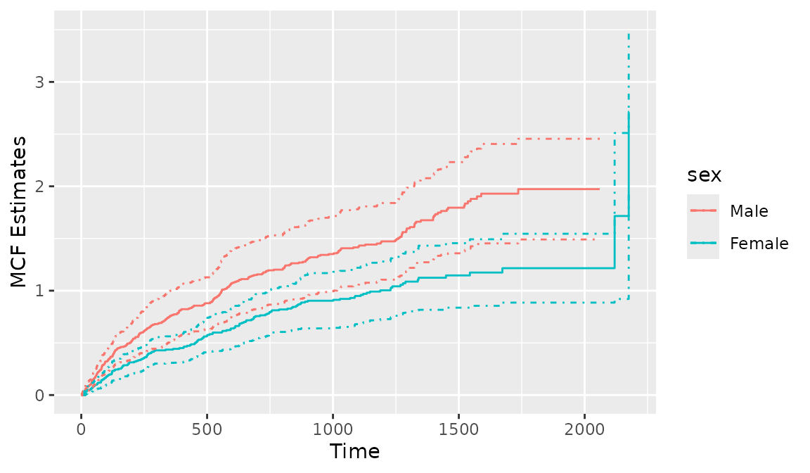
Figure 8: Creating a MCF plot with mcf()
In the presence of informative censoring, the NPMLE of (Wang, Jewell, and Tsai 1986) can be plotted by first fitting an intercept-only model with reReg(), then applying the generic function plot(). The Recur object is used as the formula response. The following code illustrate this feature with output displayed in Figure 9.
> mcf1 <- reReg(Recur(t.start %2% t.stop, id, event, death) ~ 1, data = readmission)
> plot(mcf1)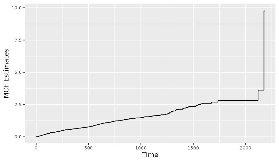
Figure 8: Creating a MCF plot with reReg()
The 95% confidence interval is computed based on the non-parametric bootstrap approach with 200 bootstrap replicates as specified by the argument B = 200. Separate MCFs can be created and plotted for each level of a factor variable using the subset option in reReg(). The basebind() function can then be applied to combine the MCFs into one plot to allow easy visual comparison. The synopsis for basebind() is shown below.
> args(basebind)function (..., legend.title, legend.labels, control = list())
NULLThe arguments are
-
...is a list ofggplotobjects created by plottingreRegobjects. -
legend.titleis an optional character strings to control the legend title in the combined plot. -
legend.labelsis an optional character strings to control the legend labels in the combined plot.
When fitting regression models with reReg(), the baseline() function can be applied to combine the estimates of baseline functions across groups. The following code is used to create Figure~ 9. where the NPMLEs for sex = "Female" and sex = "Male" are presented. The corresponding 95% confidence intervals are computed with 200 bootstrap replicates.
> mcf2 <- reReg(Recur(t.start %2% t.stop, id, event, death) ~ 1, subset = sex == "Female", data = readmission, B = 200)
> mcf3 <- update(mcf2, subset = sex == "Male")
> g1 <- plot(mcf2)
> g2 <- plot(mcf3)
> basebind(g1, g2, legend.title = "Sex", legend.labels = c("Female", "Male"))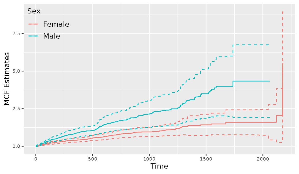
Figure 9: Creating a stratified MCF plot with reReg()
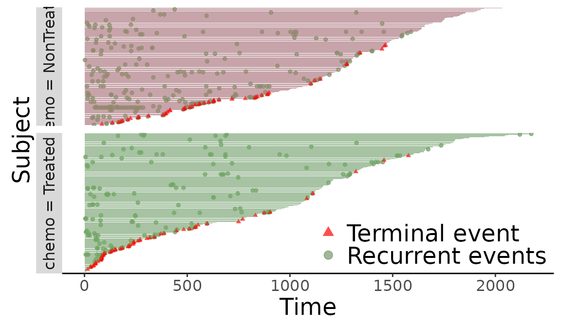
Linking with ggplot
We will take the following readmission data for example.
> library(ggplot2)
> (f <- plotEvents(Recur(t.stop, id, event, death) ~ chemo, data = readmission))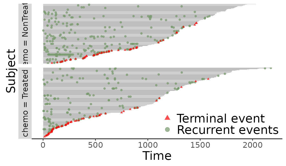
Figure 10: Event plot grouped by chemo.
Add axis breaks
> f + scale_y_continuous(breaks = seq(0, 2000, 100)) + ylab("Days since surgery")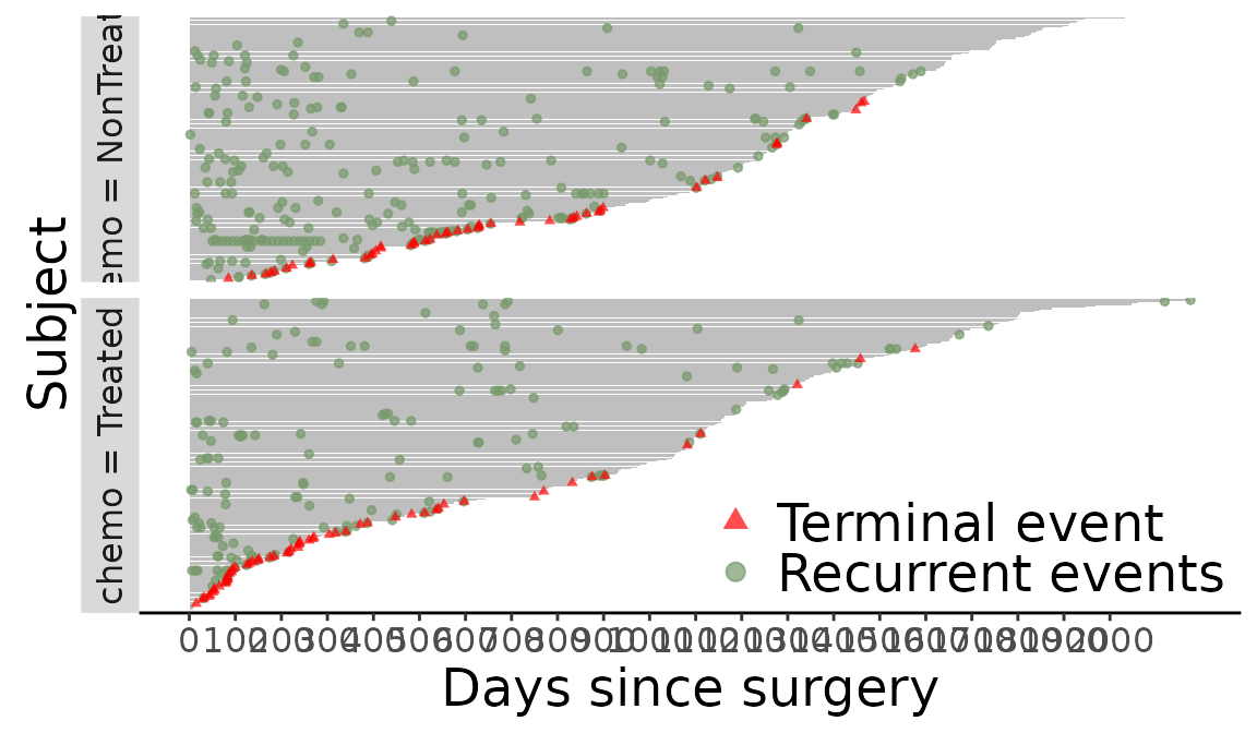
Figure 11: Add axis breaks
Replace labeling strip in event plot
> labels <- c("chemo = Treated" = "Yes",
+             "chemo = NonTreated" = "No")
> f + facet_grid(chemo ~., scales = "free", space = "free", switch = "both",
+                labeller = labeller(chemo = labels)) +
+   xlab("Received chemo?")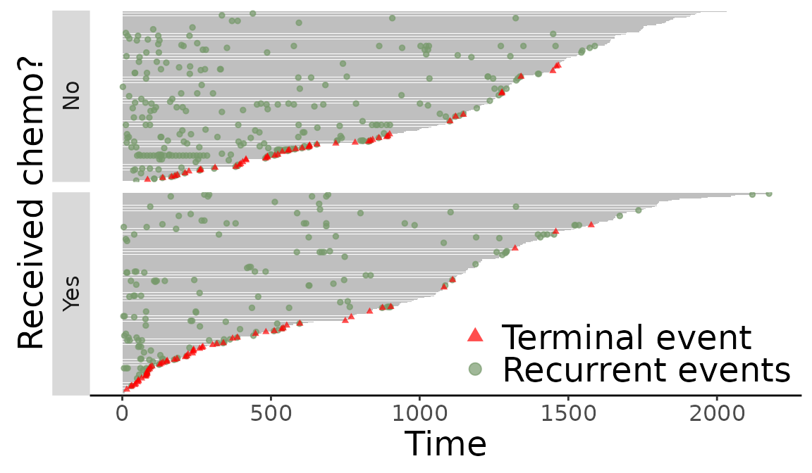
Figure 12: Replace labeling strip in event plot
Reference
Cook, Richard J., and Jerald Lawless. 2007. The Statistical Analysis of Recurrent Events. New York: Wiley.
González, Juan Ramón, Esteve Fernandez, Víctor Moreno, Josepa Ribes, Mercè Peris, Matilde Navarro, Maria Cambray, and Josep Maria Borrás. 2005. “Sex Differences in Hospital Readmission Among Colorectal Cancer Patients.” Journal of Epidemiology & Community Health 59 (6): 506–11.
Rondeau, Virginie, Yassin Mazroui, and Juan Ramń González. 2012. “frailtypack: An R Package for the Analysis of Correlated Survival Data with Frailty Models Using Penalized Likelihood Estimation or Parametrical Estimation.” Journal of Statistical Software 47 (4): 1–28.
Wang, Mei-Cheng, Nicholas P. Jewell, and Wei-Yann Tsai. 1986. “Asymptotic Properties of the Product Limit Estimate Under Random Truncation.” The Annals of Statistics 14: 1597–1605.
Wang, Wenjie, Haoda Fu, Sy Han Chiou, and Jun Yan. 2021. reda: Recurrent Event Data Analysis. https://github.com/wenjie2wang/reda.
Wickham, Hadley. 2009. ggplot2: Elegant Graphics for Data Analysis. Springer-Verlag New York. http://ggplot2.org.